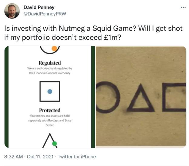
An adviser has likened Nutmeg’s latest website refresh, which features a circle, square and triangle, to Netflix’s increasingly popular Korean survival drama series Squid Game.
David Penney, a chartered financial planner and director at Penney Ruddy & Winter, said the design the investment platform made live on its website this morning (October 11) reminded him of the show’s hierarchical symbols - a circle, square, and triangle.
The nine-part Korean thriller, which reached Netflix’s number one spot in 90 counties within just 10 days of its release, invites a group of people in debt to play children’s games in order to win back up to ₩45.6bn (£28m). The catch being, if they lose, they are immediately killed.
Penney joked: “Is investing with Nutmeg a Squid Game? Will I get shot if my portfolio doesn’t exceed £1m?”
The symbols discern the order of authority of Squid Game workers, which go from circle - the lowest rank - to triangle, the highest rank.
A spokesperson for Nutmeg told FTAdviser it had been working on its rebrand “for many months”.
“We did the switch-over late last night and early this morning,” they said, confirming that customers have received an email notifying them of the icon changes to ensure they are not taken advantage of by scammers through their old brand.
Explaining the thinking behind the rebrand, the spokesperson said: “As our clients’ investment journeys continue, we want to increasingly focus on the human stories that our investment strategy, technology and team are powering.
“Our vision is the same as it was when we launched nine years ago: to bring investing and wealth management to a wider audience, bring transparency with a great user experience and to help people to reach their goals.
“Over the last decade our business has grown and today we’re proud to launch the new evolution of Nutmeg’s visual identity.”
The investment platform has also shared a blog post discussing the reasons behind its new look, which includes a new logo, new typeface and colour scheme, a new website, and new email templates.
It added in this post: “Our product set expanded with new investment styles and tax wrappers, new payment methods and an enhanced mobile experience. Our clients have grown up as well.
“Many of them have been with us for years, they are more financially confident and Nutmeg has become part of their life, as they reach financial milestones and adapt their goals.
Whilst Nutmeg overhauled its design to move away from its fintech start-up origins, following its acquisition by JPMorgan Chase, the company still claims to hold its beginnings close.
“We are still a challenger at heart, but a more grown-up one. We still like to challenge with our thinking, and our innovative ideas are backed by experience.”
Nutmeg did not acknowledge the comparisons between its new branding and Netflix’s Squid Game.


